
PARAT.cc is a Design Studio for Branding in Culture, Politics, and Business.


Museum Brandhorst – Party of Life
info
Campaign and exhibition design for the first show worldwide focusing on the two Pop Art icons Andy Warhol and Keith Haring at Museum Brandhorst in Munich. It is the most successful show in the history of the Museum with over 150.000+ visitors. The campaign included video trailers, print products and a social media campaign.


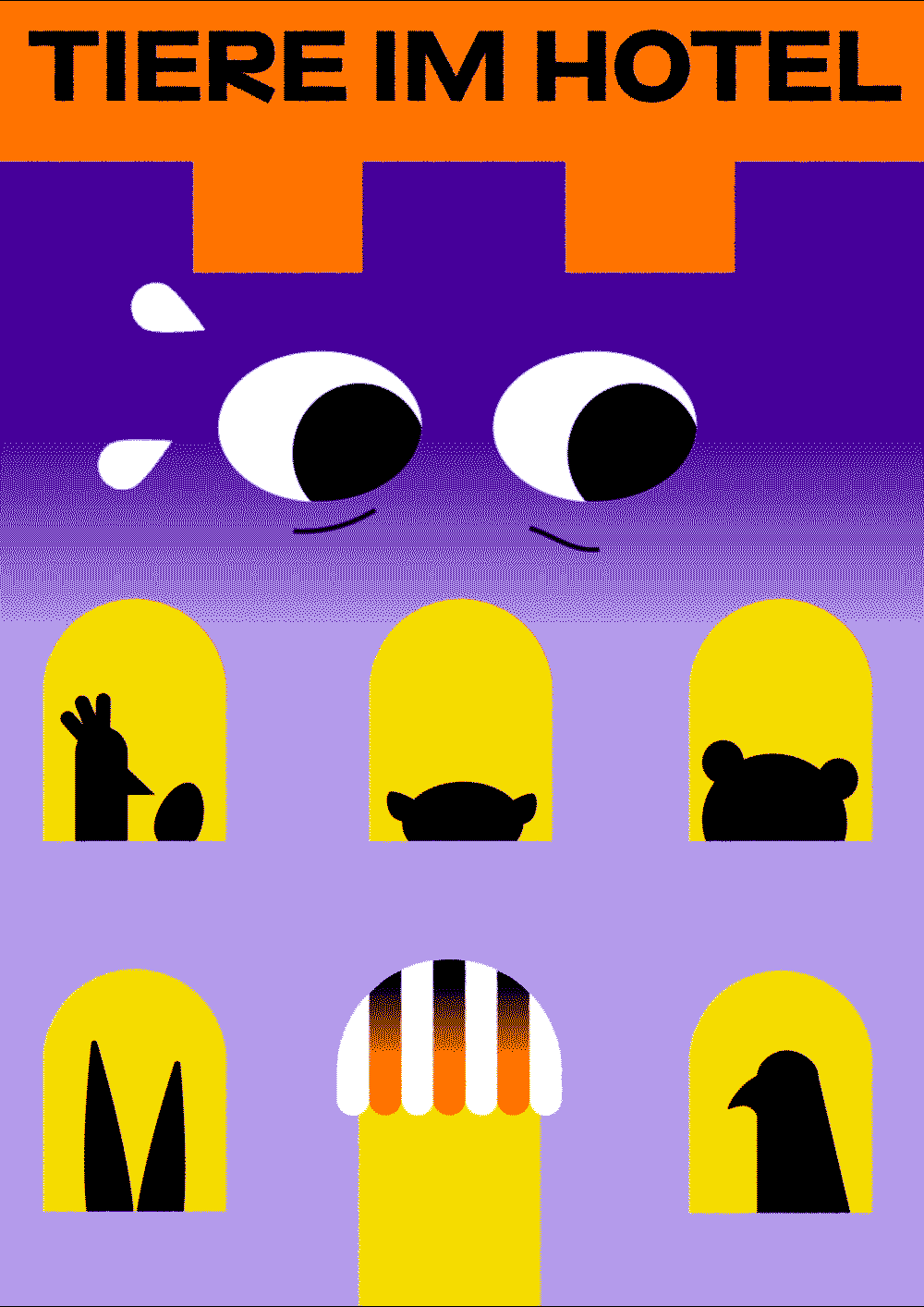
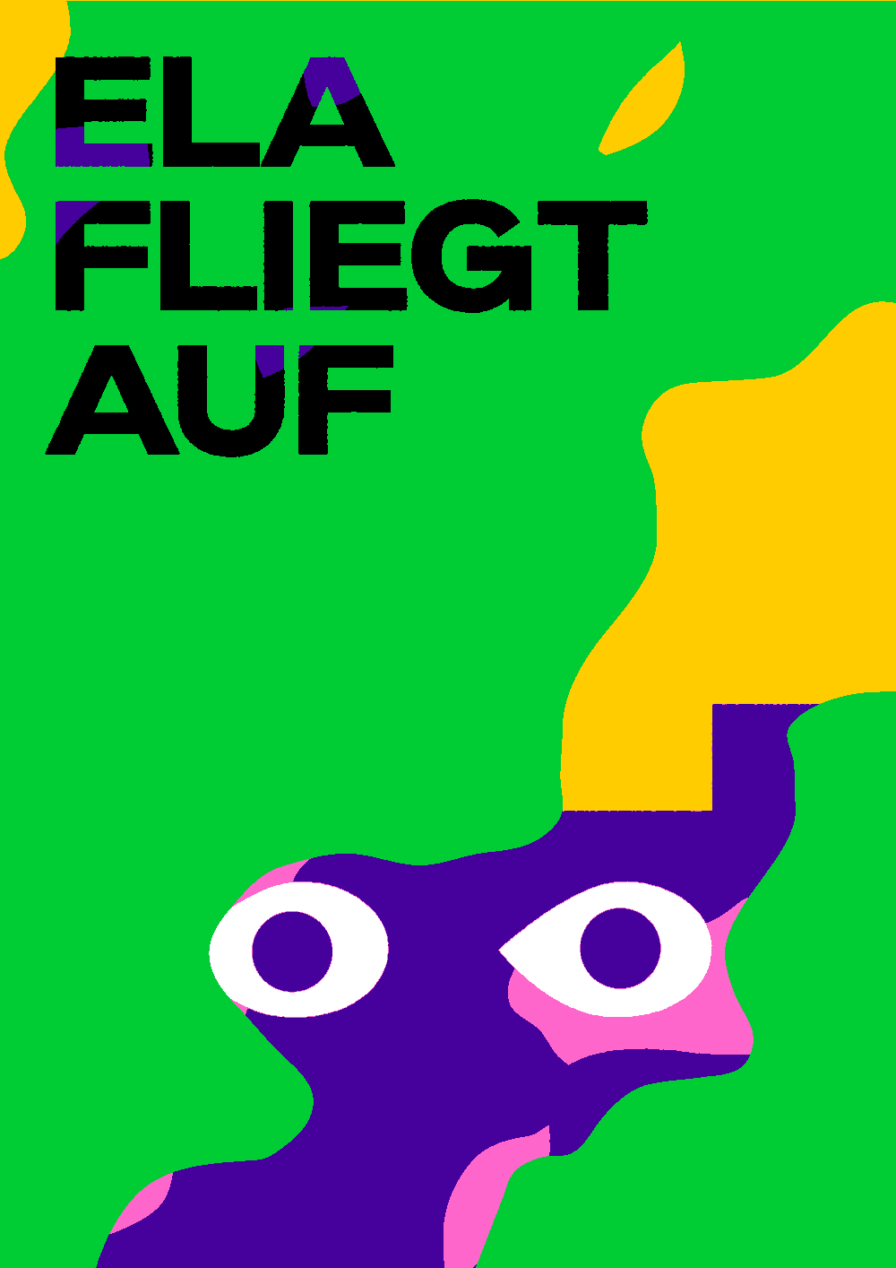
Schauburg 2024/25
info


Various Others 2024
info


Rathausgalerie
info
A new graphic identity for Rathausgalerie München, a civic gallery in Munich. Inspired by the characteristic tiled floor, our identity sets a frame for each new exhibition. Rathaus Grotesk, the typeface in use, draws also inspiration from the tiles and was exclusively designed by us for the gallery.
Image credits: PARAT.cc, Fabian Frinzel


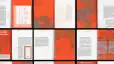
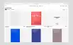
Schönste Deutsche Bücher–Catalogue
info
Every year, the "Most Beautiful German Books" competition brings together the greatest designers and the most ingenious production ideas. With the 2023 catalogue, we wanted to slow things down a little. Simple and practical—like a telephone directory when it still had a meaning. All the information about each work is presented in one place, with each book given as much space as possible, shown from all sides. A thumb index provides an overview and the best possible usability.
With the catalogue’s provocatice cover, embossed gold on pink, we wanted to ask: How do we standardise beauty? Inside, it's a bit of a tease with a maximum of blandness: All we show is flat scans, printed on cheap greyish works paper, all info set in an oversized, brittle Arial Typeface.


Museum Brandhorst – Forever Young
info
Anniversary Campaign for Museum Brandhorst
Our task: Concept, Campaign design, Type Design.
Collaboration with Nam Huynh
Image credits: PARAT.cc and Museum Brandhorst


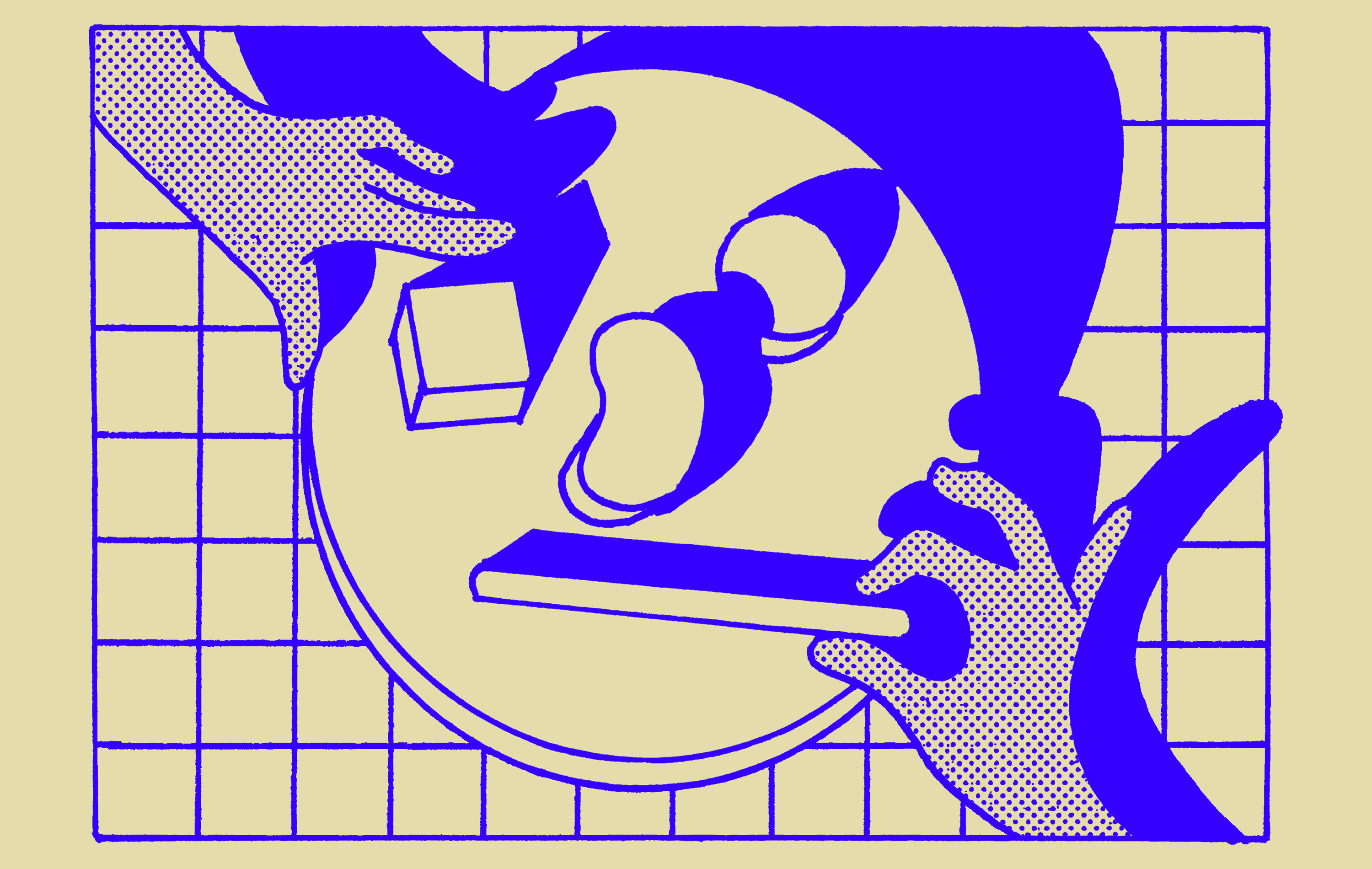
Future Bodies–Campaign
info
Exhibition identity for MUSEUM BRANDHORST
The exhibition brings to life a hitherto little-noticed phenomenon in art, and more particularly in sculpture: the reciprocal interpenetration of body and technology. With more than 100 works and several large-scale installations by about 60 artists—primarily from Europe, the United States, and Japan—the exhibition focuses on the major technological changes since World War II and their influence on our ideas of the body.
Our tasks: Visual identity, campaign, exhibition design, bespoke typeface design
Image credits: PARAT.cc, Museum Brandhorst
Animation in collaboration with Aljoscha Höhborn.


Venezia 500–Advertising Pillar
info
Image credits: PARAT.cc
Animation: Aljoscha Höhborn


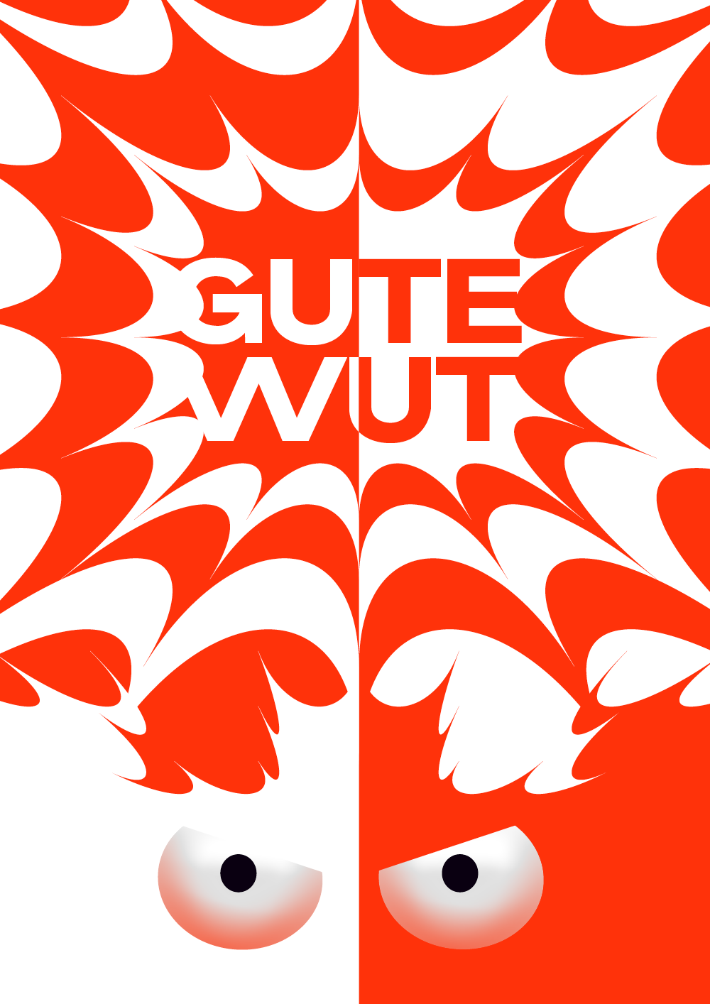
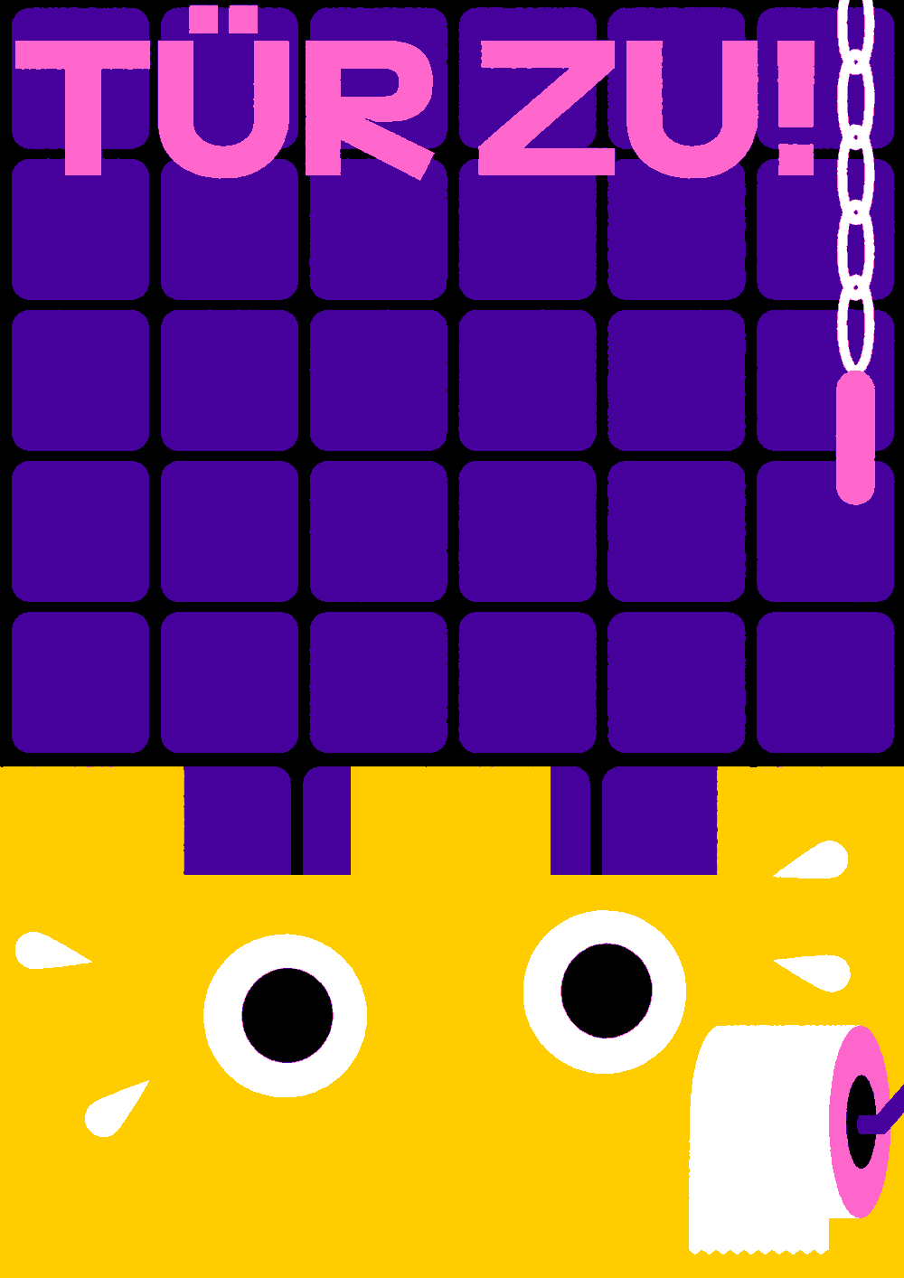
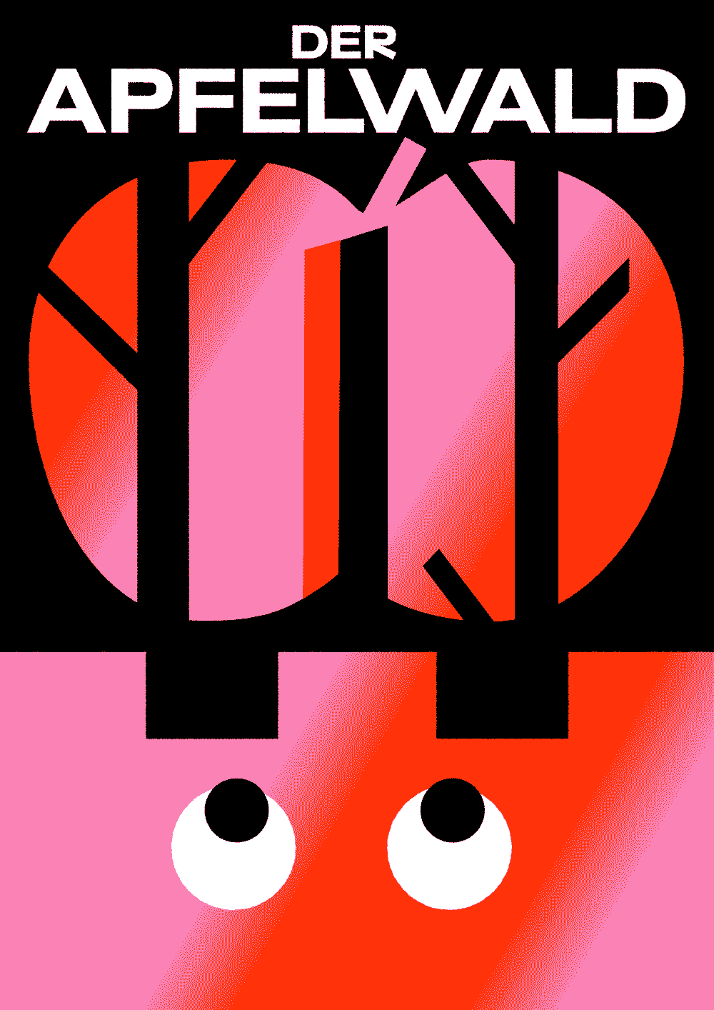
Schauburg 2023–Campaign
info
Concept and illustration for the 2023 campaign of SCHAUBURG.
The SCHAUBURG is one of the largest and most renowned theatres for young audiences in Germany.
This season, together with the SCHAUBURG team, we are asking WHY DO WE FIGHT? But also FOR WHAT? and HOW? Because no life together is without conflict. Only there, where it is mostly suppressed in a brutal way—in any form of autocracy. So it is a matter of shaping our quarrels well. Constructive, passionate, committed, fair: For the best solutions, for the right to dispute, for peace and joy, and not least about art. Let us argue well.
Our Tasks: Concept, Text, Ideation, Campaign Design, Editorial Design
Image credits: PARAT.cc


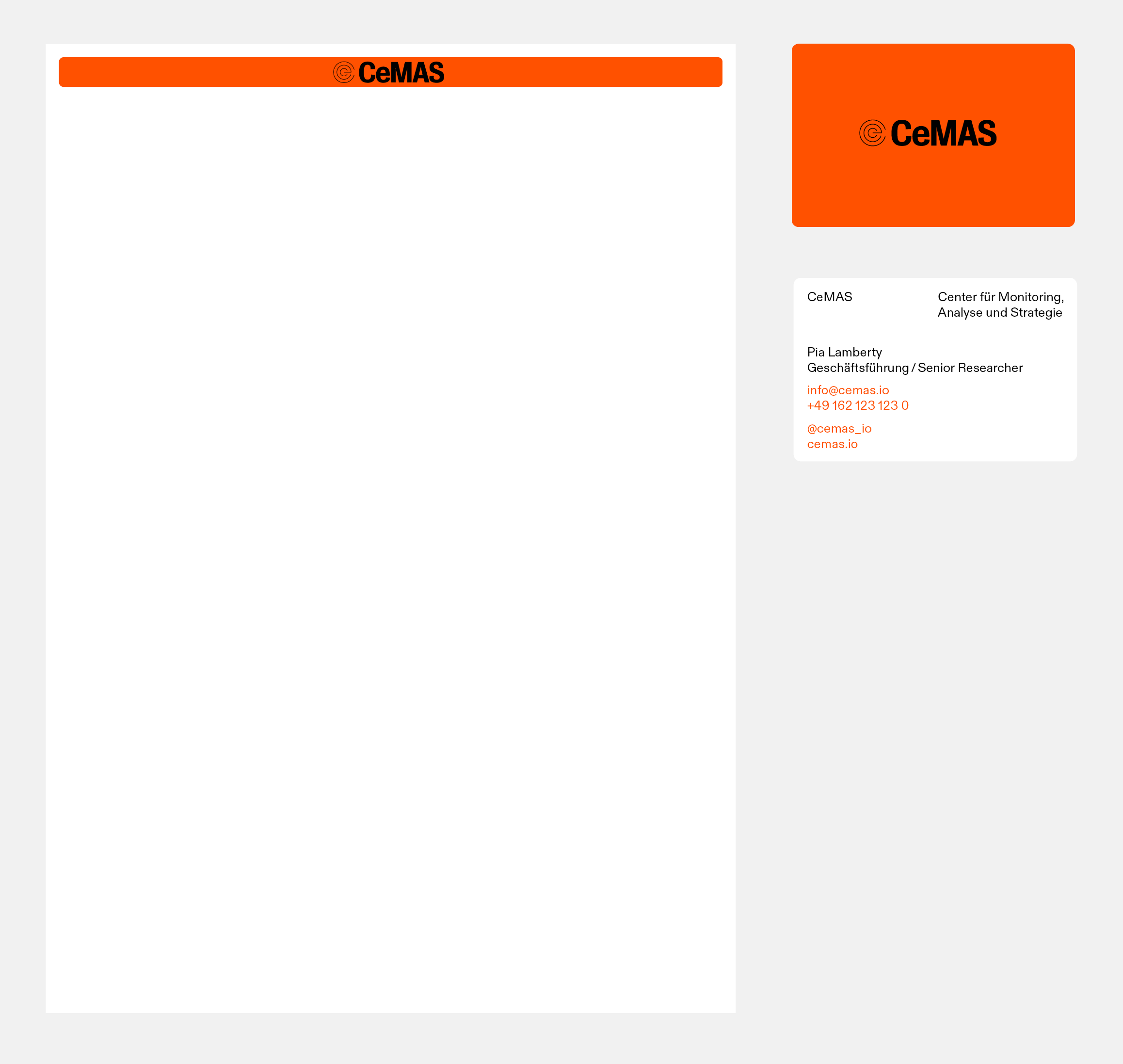
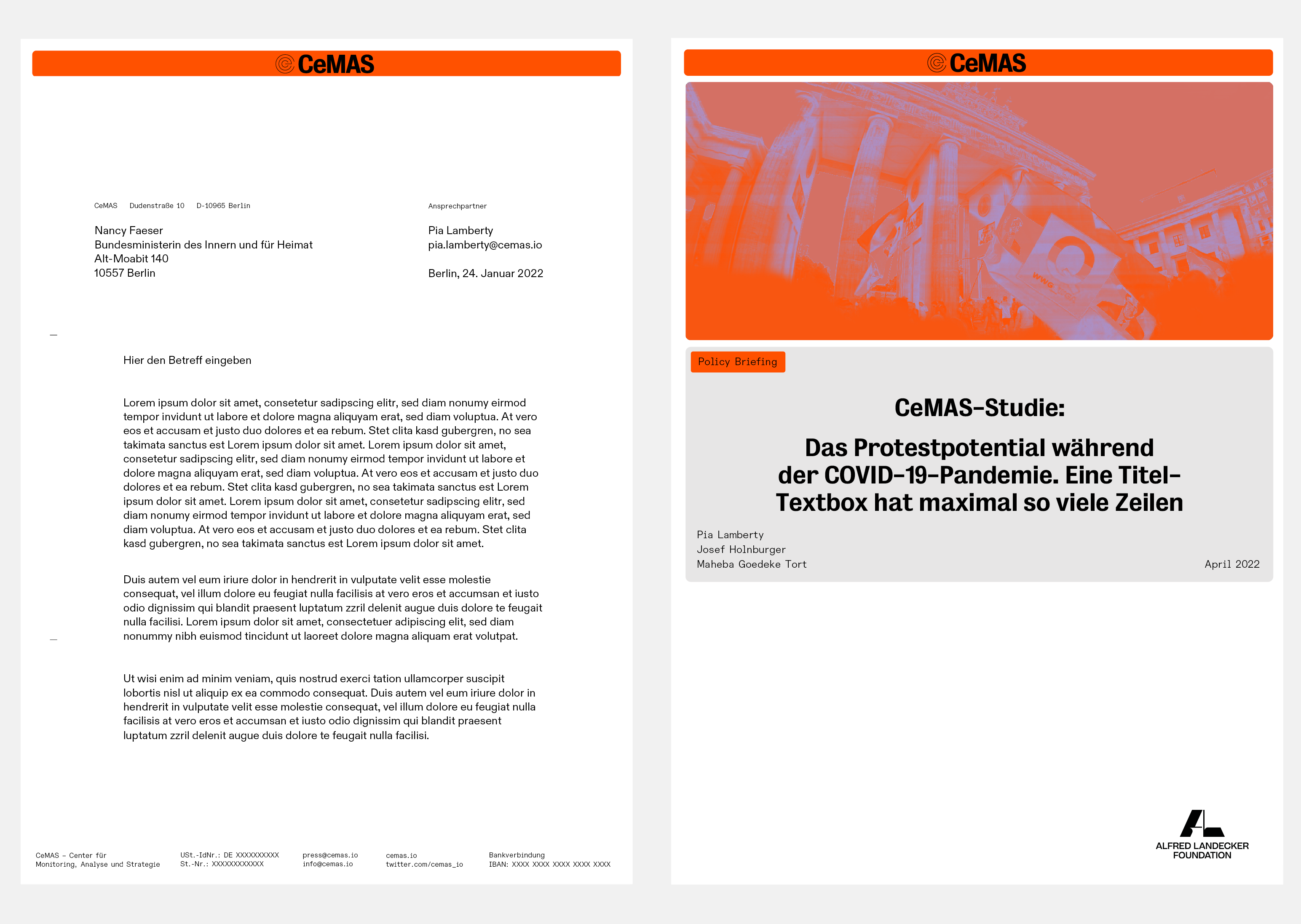


CeMAS–Logo Animation
info
Corporate Design for CeMAS. The nonprofit Center for Monitoring, Analysis, and Strategy (CeMAS) consolidates years of interdisciplinary expertise on the topics of conspiracy ideologies, disinformation, antisemitism, and right-wing extremism. CeMAS addresses current developments in the above-mentioned fields through systematic monitoring of central digital platforms and modern study designs in order to derive innovative analyses and recommendations for action. Furthermore, CeMAS advises decision makers from civil society, media and politics.

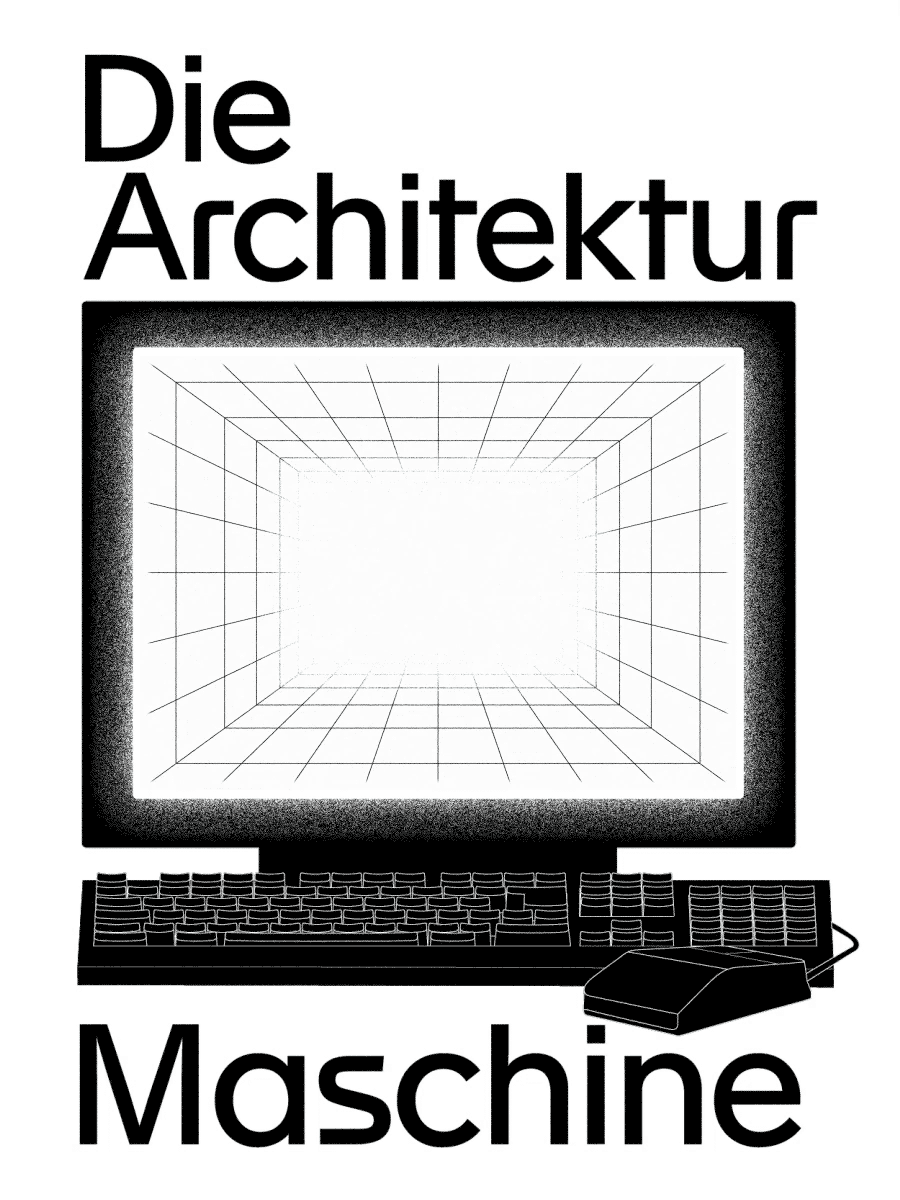


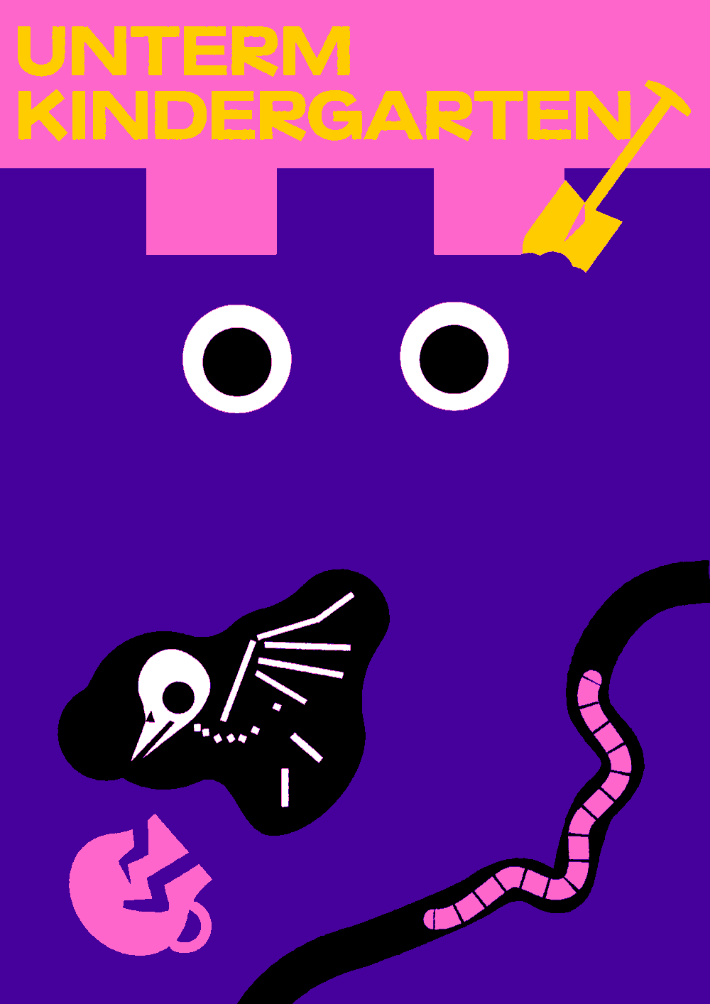
Die Architekturmaschine Exhibition
info
Die Architekturmaschine
Exhibition identity and book design for Museum of Architecture in Munich.
Architecture was swept up in the digitial revolution a long time ago. This exhibition recounts the sotry of the influence that computers and architecture have had on each other, from the beginnings in the 1950s through to today. Obviously, these developments have changed architecture. But the question remains: In what areas did they affect architecture the most? And: How have architects influenced this process?
Exhibition design in collaboration with Curious About.
Image credits: Florian Bengert, Fabian Frinzel, PARAT.cc


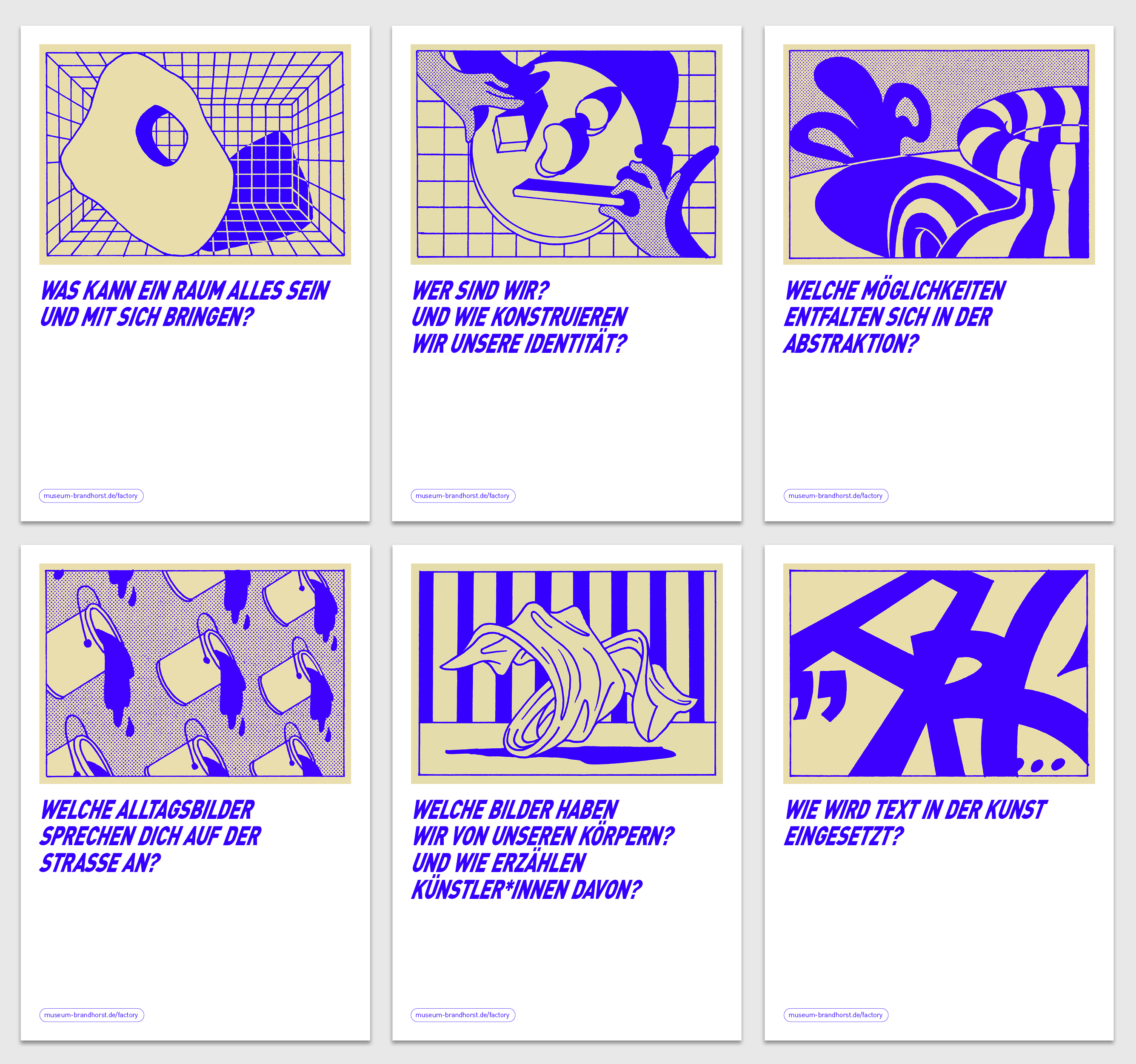
Factory Junge Nacht–Social Media Campaign
info
As part of our branding for the Museum Brandhorst FACTORY we were asked to design a communication concept and identity for “Junge Nacht,” a block party in the courtyard of the museum. Our multilingual concept attracted a lot of attention from the young audience.
Keyvisual with Stefanie Leinhos
Motion design with Aljoscha Höhborn


max goelitz–Sign
info
Corporate identity for gallery max goelitz.
max goelitz was founded in Munich in March 2020 and shows an international and contemporary program. The gallery represents established and emerging artistic positions in conceptual and post-minimal art and focuses on the intersection of art and current technologies. The dynamic and cutting-edge gallery model is characterized by a combination of digital innovation and traditional art historical expertise. At its core is an ongoing, collaborative partnership with artists and a fundamental support of artistic freedom.
Image credits: Dirk Tacke, max goelitz gallery, PARAT.cc


UnternehmenForm–Business Cards
info
Brand development and positioning for and with the Stuttgart-based UnternehmenForm: we accompany Alexander Seifried and team in the development of a new narrative of their own identity. After 20 years, the company has evolved from a furniture retailer to outfitter for working environments, industrial design studio and event host. A new signet leads back to the origin of the company: the initials U and F, reduced to their basic shapes round and rectangular, formulate the companies claim: design through reduction to the essentials. The sub-brands UF Studio and UF Raum, as well as the company's own UF Collection, create a new order and make the versatility of UnternehmenForm visible.
Our tasks: Brand positioning and development, corporate design
Image credits: PARAT.cc, Fabian Frinzel, Zooey Braun


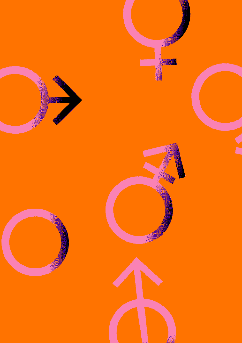
Bürgerrat Klima
info


E.M.T. in MSP–Cover
info
Publication design for Heinz Peter Knes’ work E.M.T. in MSP. Taken in the mid-1990s, the celebrated work of 85 photographs documents the artist’s younger siblings Eva, Mirjam and Thomas as they emerge into puberty and young adulthood in the small Catholic town of Fellen. E.M.T. in MSP addresses poignant issues around identity, youth and heritage through a profoundly intimate lens. The story of E.M.T in MSP’s inception is a curious one. While still a student in the mid 90s, artist Heinz Peter Knes began photographing his younger siblings in the small town of Fellen in Lower Franconia. The photos were plucked by various fashion magazines from the early 2000s forward and presented in a variety of conceits.
Image credits: Edition Taube, Heinz Peter Knes


Das Venedig Gefühl–Embossed Cover
info
Book design for Helene Jacobs
Image credits: Fabian Frinzel, PARAT.cc


Schauburg 2022–Poster Campaign
info
The 2022 campaign for Schauburg was all about a celebration of the community. After months of shutdown due to COVID19, the theatre wanted to celebrate its diverse audience. Together wit the team, we developed the season’s motto: "100% us"
Campaign photography with Fabian Frinzel


Ossian Fraser Dissolving Acts–Chapter Opener
info
An artist monograph for Ossian Fraser, edited by Christian Ganzenberg and Lydia Korndörfer


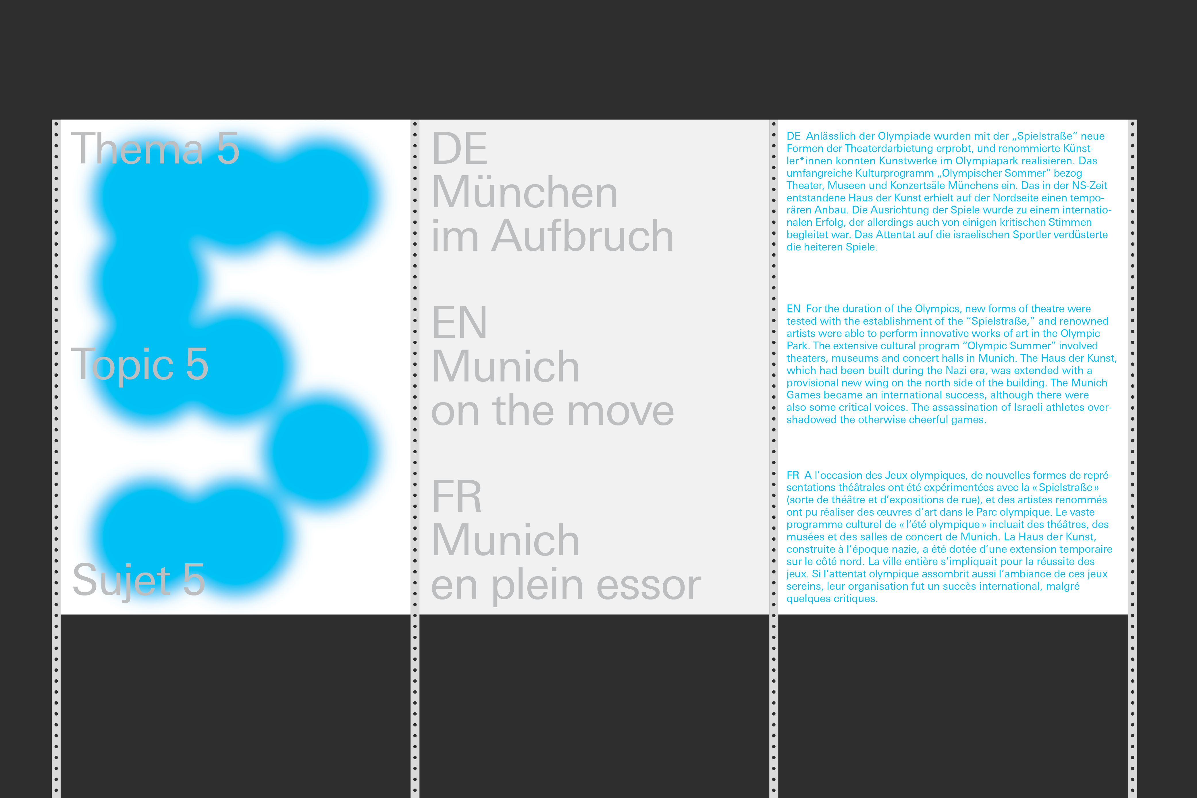


Olympiastadt München–Signage System
info
Exhibition and publication for the TUM Museum of Architecture.
Die Olympiastadt München (The Olympic City of Munich) celebrates the 50th aniversary of the Olympic Games 1972 in Munich and reviews how the architecture and urban planing for the Olympic Games have shaped the city. With numerous unknown documents and models, the large-scale exhibition spans a thematic arc from the reconstruction of the city to the "Olympics in the Green" with the world-famous tent roof, the sports facilities and the Olympic Village as well as the visual image to the Olympic legacy. Questions of self-portrayal, sustainability and understanding of democracy are the focus of the presentation.
Exhibition design together with curious about.
Curatorial team: Irene Meissner, Lisa Luksch andElla Neumaier
Image credits: PARAT.cc, Fabian Frinzel


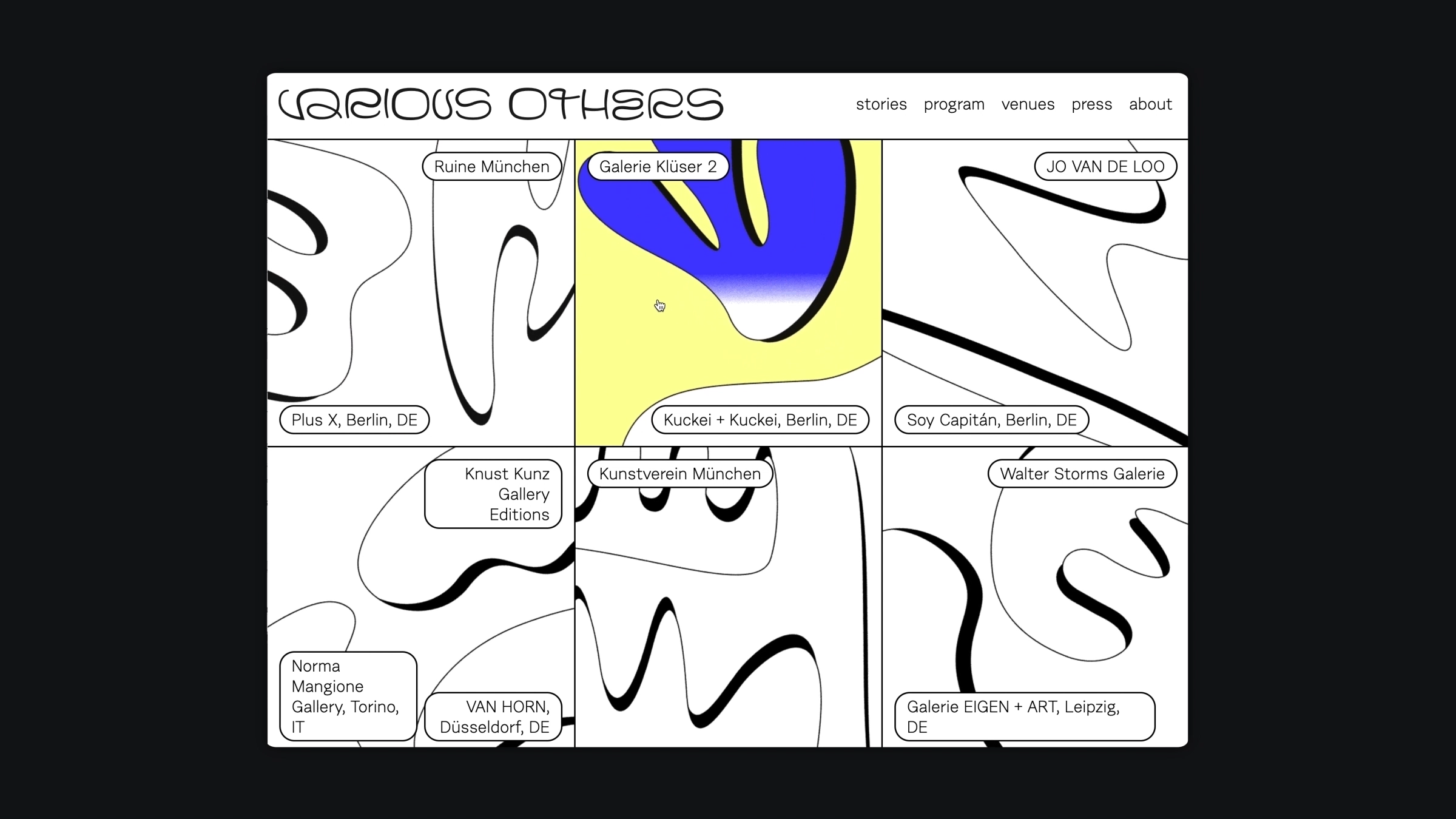


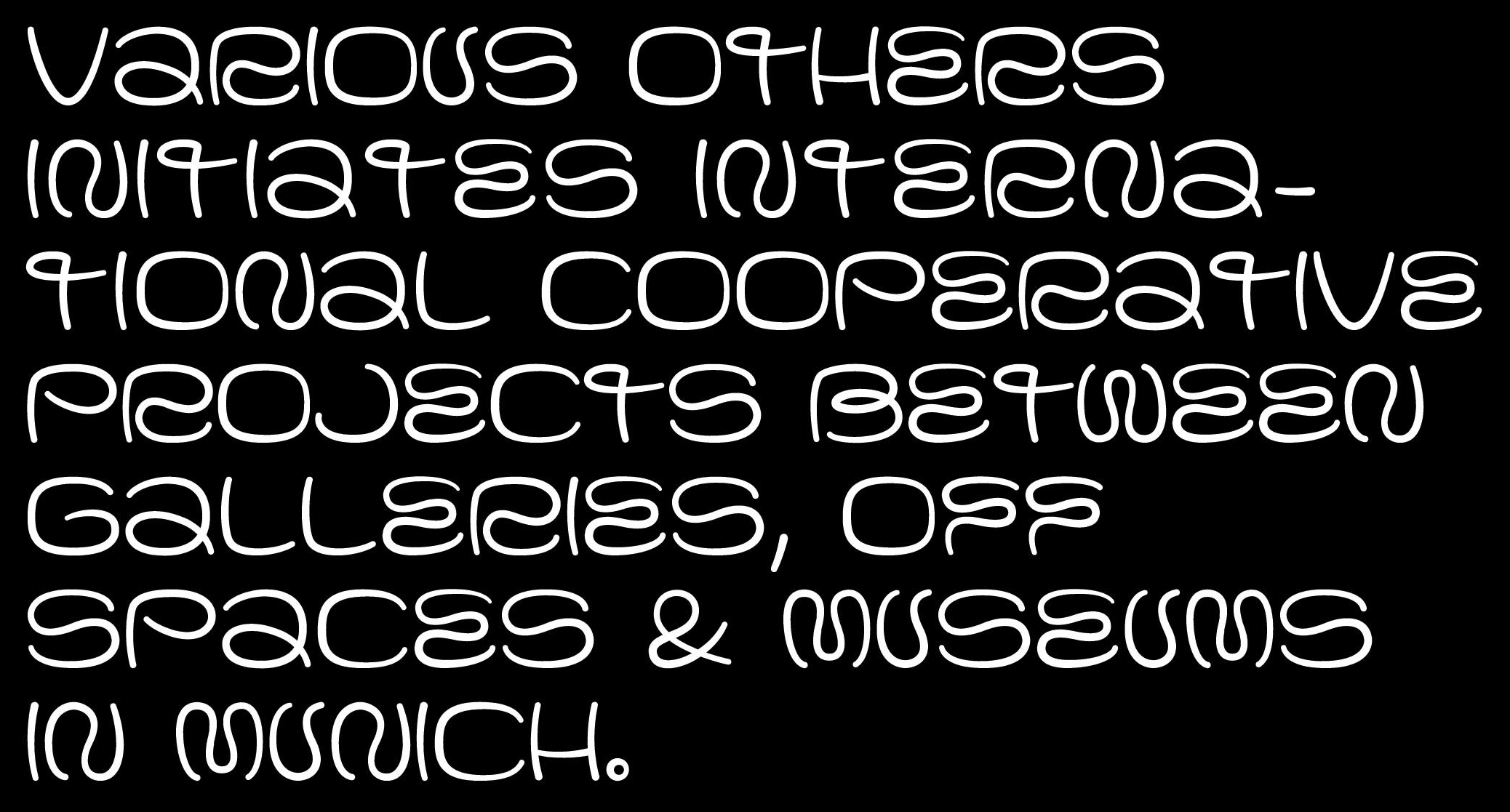
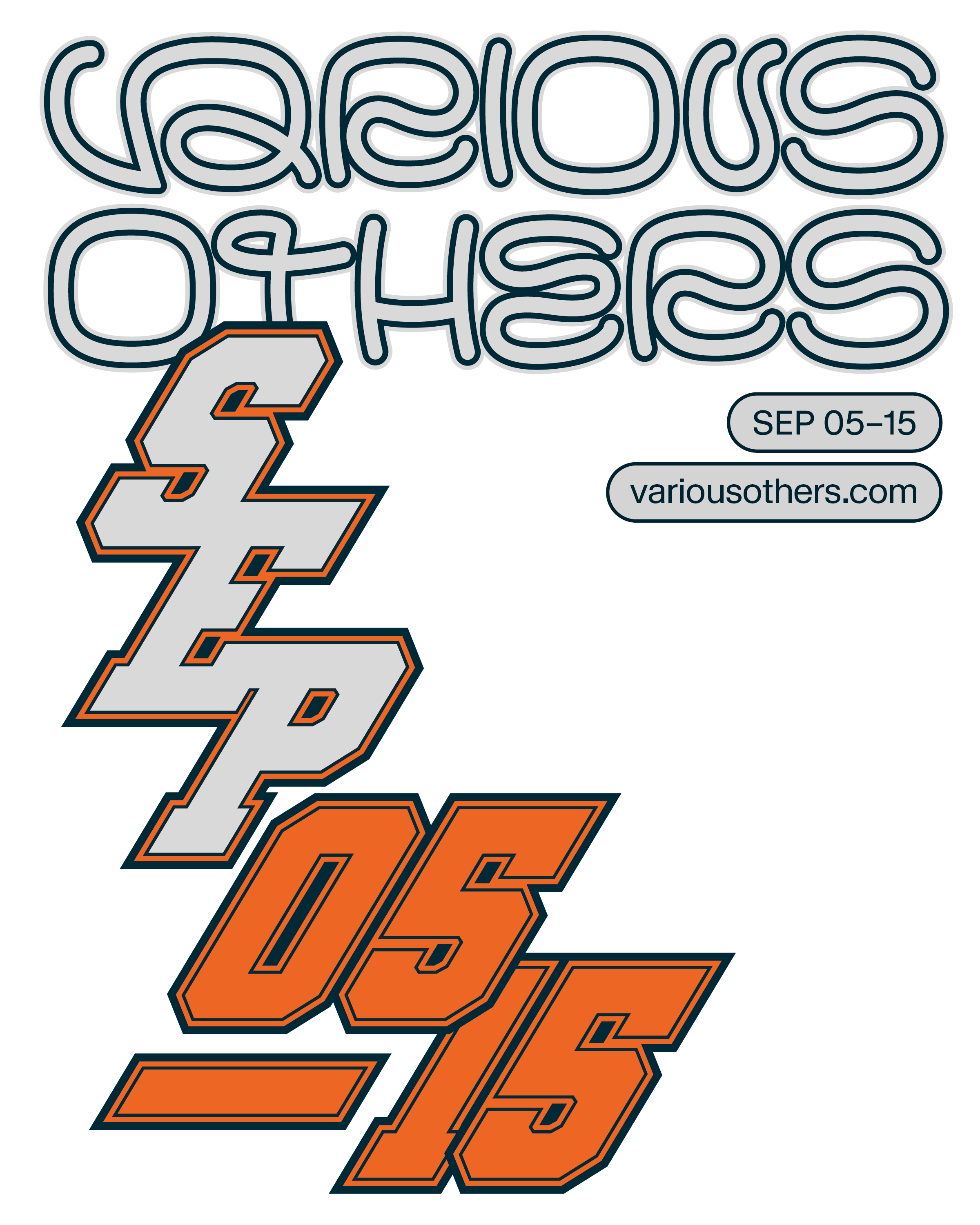
Various Others 2021–Social Media Campaign
info
Since 2018 we accompany and consult VARIOUS OTHERS, an art festival in Munich.
With our bespoke typeface, we gave the format a unique face and high recognizability both in the city and internationally.
VARIOUS OTHERS is the international format of the Munich art scene. Its most ambitious players—galleries, artist-run spaces, and institutions—invite you to get to know the city’s most important art venues in all their diversity. In collaboration with international partners, VARIOUS OTHERS offers artists, collectors, curators, gallery owners, and art enthusiasts from all over the world contemporary art of the highest quality and relevance.
Image credits: VARIOUS OTHERS & PARAT.cc


Factory Museum Brandhorst
info
Brand development for the Museum Brandhorst FACTORY
No matter how, when or where—the FACTORY is an open creative laboratory. It is an artistic production space that is part of Museum Brandhorst.
It is both workshop and digital program that enables visitors to conduct their own creative experiments in the footsteps of the Museums artists, regardless of their location.
Wayfinding and spatial design together with Sauerbruch & Hutton,
Website together with 4th Motion.
Image credits: Museum Brandhorst, Constanza Melendez and PARAT.cc


Heaven in Clouds
info
Book design for Peter Granser’s work Heaven in Clouds
Image credits: Peter Granser & PARAT.cc


Haus im Tal–Wordmark on greeting card
info


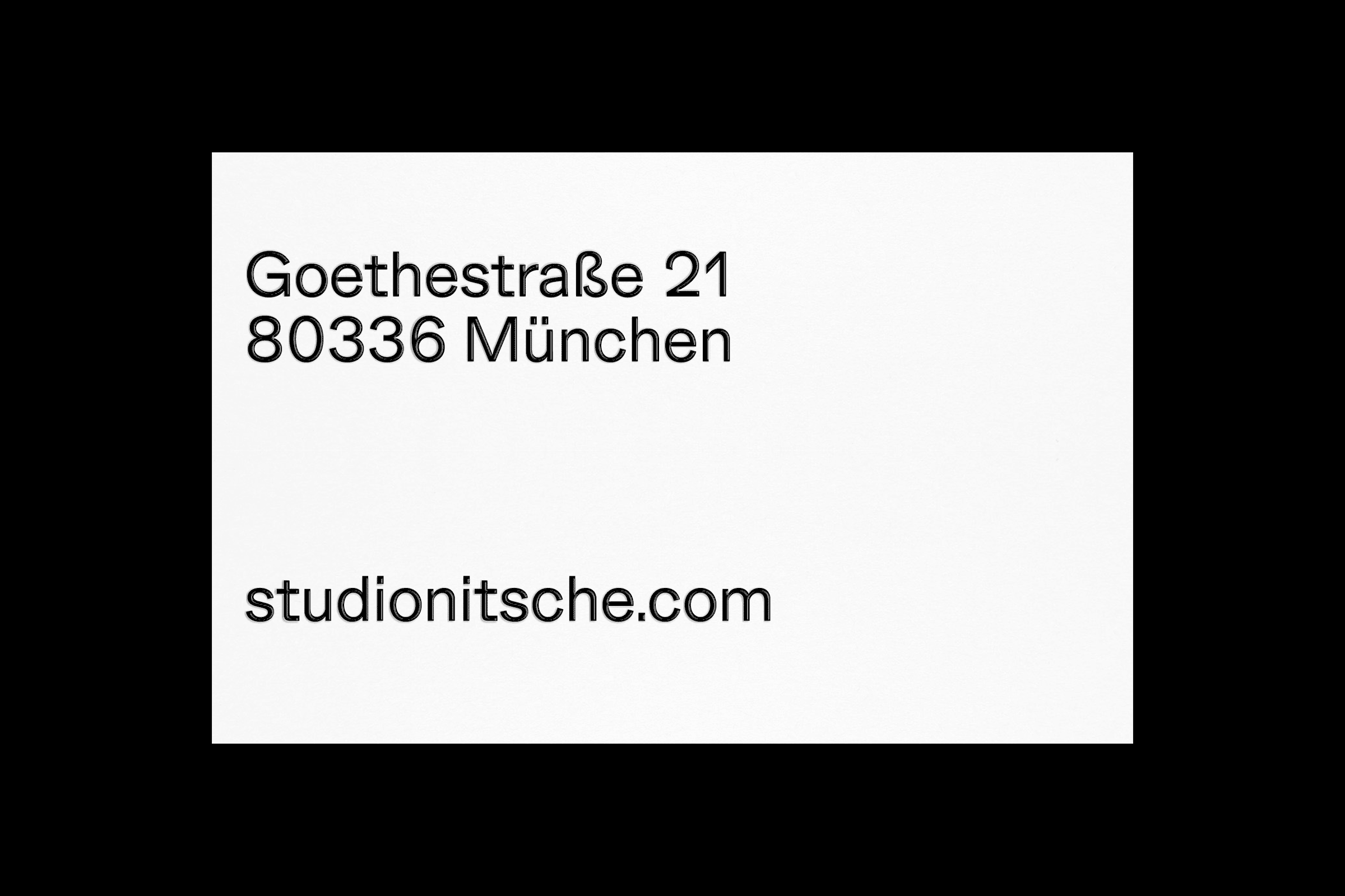


Studio Nitsche Identity
info


Various Others 2019–Citylight
info
Since 2018 we accompany and consult VARIOUS OTHERS, an art festival in Munich.
With our bespoke typeface, we gave the format a unique face and high recognizability both in the city and internationally.
VARIOUS OTHERS is the international format of the Munich art scene. Its most ambitious players—galleries, artist-run spaces, and institutions—invite you to get to know the city’s most important art venues in all their diversity. In collaboration with international partners, VARIOUS OTHERS offers artists, collectors, curators, gallery owners, and art enthusiasts from all over the world contemporary art of the highest quality and relevance.
Image credits: VARIOUS OTHERS & PARAT.cc


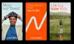
88 Stones–Cover
info
Book design for Peter Granser.
This book contains 88 stones collected by Peter Granser and his wife Beatrice Theil near a small hut in the village of Kamiyama on the island of Shikoku. Shikoku is famous for the Ohenro (虃笭), a pilgrimage path connecting 88 temples, and for its stones, which are used in many Japanese gardens.


Die Architekturmaschine Book
info
Die Architekturmaschine
Book design for Museum of Architecture in Munich.
Architecture was swept up in the digitial revolution a long time ago. This exhibition recounts the sotry of the influence that computers and architecture have had on each other, from the beginnings in the 1950s through to today. In four chapters, it presents the computer as a drawing machine, as a design tool, as a medium for storytelling, and as an interactive communication platform. Obviously, these developments have changed architecture. But the question remains: In what areas did they affect architecture the most? And: How have architects influenced this process?


HKF HölzlKnoteFrischholz
info
Brand identity, stationary and website for HKF — Hölzl Knote Frischholz Architects
Image credits: HKF & PARAT.cc


Max Beckmann
info
Identity and campaign for the exhibition Max Beckmann — Departure at Pinakothek der Moderne
Image credits: PARAT.cc


Schauburg 2018–Season Booklet
info


ITO
info


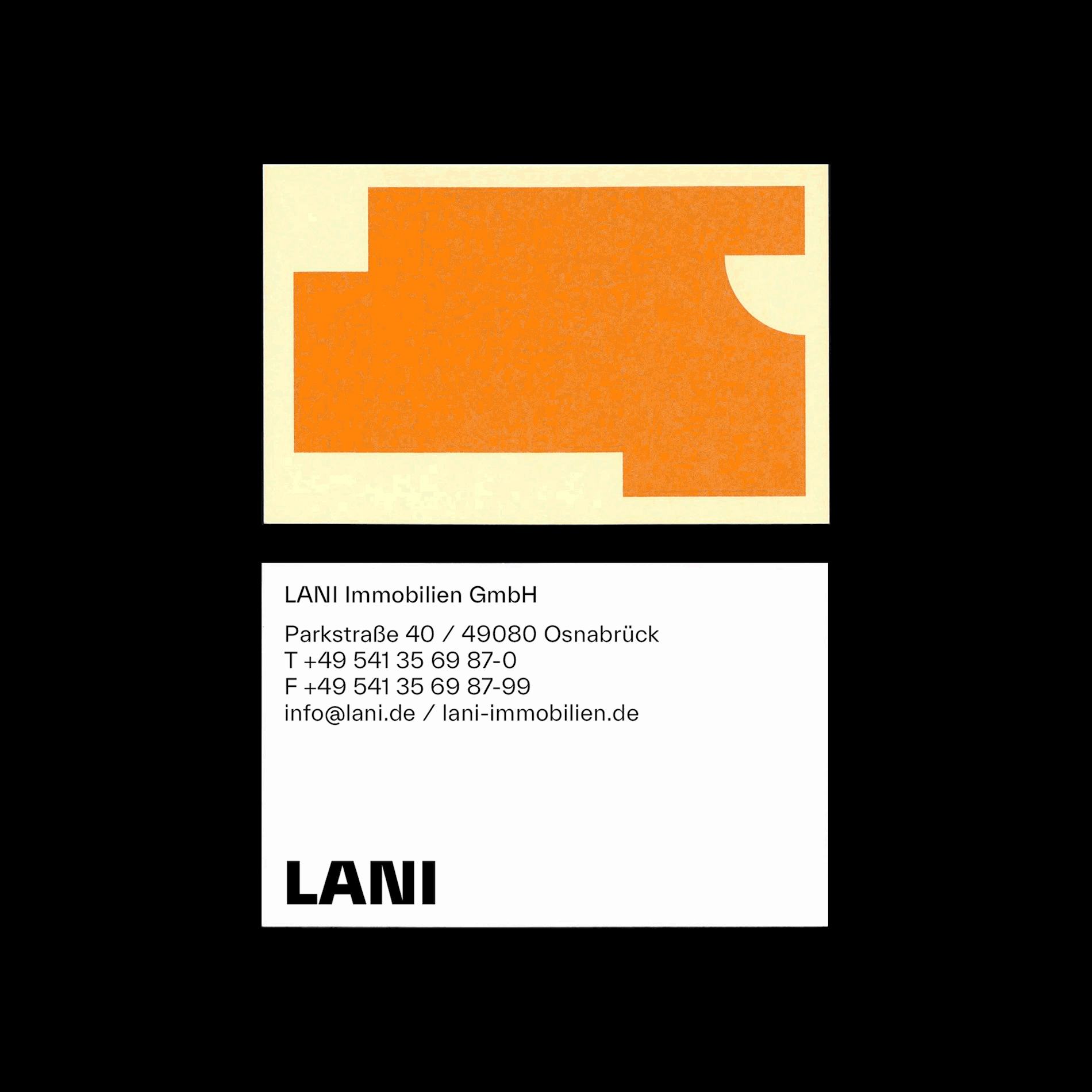


LANI Immobilien
info


Rindon Johnson Clattering
info


pflücken
info
Brand Identity and website for pflücken architects


VREL?
info
Identity and campaign for the exhibition VREL? Jacobus Vrel. Looking for clues of an enigmatic painter at Alte Pinakothek Munich
Image credits: PARAT.cc


Schauburg Spielzeit 2021–Animated Poster
info


Edition Taube Identity
info
Edition Taube is a publishing house specialized in artists’ books & editions based in Munich / Zurich. It was founded by the members of PARAT.cc. Together with Nolan Paparelli, we developed a subtle redesign of the corporate identity around the known bird symbol and the introduction of a new typeface, FT Kunst Grotesk. The new identity is very simple and straightforward: one font, a few type sizes and clear grid systems.


ListNRide–Logo Animation
info
Redesign and UI System for ListNRide
Strategy: Andreas Stolz
UX: Michael Berninger
Photography: Fabian Frinzel, Bengt Stiller
Illustration: Anne Albert


von Gagern, Ludwig, von der Mühlen: Bauten 1958–1998
info
Jürgen von Gagern, Peter Ludwig und Udo von der Mühlen stehen für avantgardistische Bauten, die seit den 1960er und 1970er Jahren das Stadtbild Münchens als feste Größe mitprägen. Der Band zeigt die Genese des Œuvres vom Wiederaufbau und Brutalismus bis zur Postmoderne.
Herausgegeben von Benjamin Eder und Stefan Imhof
Entstanden am Lehrstuhl für Städtische Architektur an der School of Engineering and Design der TU München
Erschienen im Hirmer Verlag
Fotos: The Pk. Odessa Co; Markus Lanz, Sebastian Schels
Font: Walter by Omnigroup & Dinamo


For Children. Art Stories since 1968
info
Exhibition catalogue for Haus der Kunst. On more than 420 pages, the publication “For Children” features works by artists that address young people, presenting a comprehensive survey of such art created between 1968 and the present.
Edited by Andrea Lissoni, Emma Enderby, and Lydia Korndoerfer.
Published by DISTANZ Verlag.
Fonts in use: Karl Ultra by Source Type and Affix by ALLCAPS.